

Rochelle Feinstein
20.4. —
16.7.2018
Selected press coverage
Project partners
Rochelle Feinstein’s subjects are no less than freedom of opinion, feminism, racism, the AIDS crisis and Donald Trump. Over nearly thirty years the New York artist, a long-time professor of painting and printmaking at Yale University, has created a body of work that reveals itself as politically caustic yet densely humorous.
Her painting, which the viewer generally encounters in a forceful blast, deals consistently with the cultural and political connections of artistic production, transferring everyday individual and collective feelings into a language of abstraction. For Feinstein, painting is an anti-hierarchical endeavour to answer the question of what the medium can mean today, societally and culturally, without being limited by traditional forms. Her greatest critic, or, to put it better, her closest observer, is Rochelle Feinstein herself. Through an unswerving challenge to the meaning of painting in the world today she gives a voice back to painting: a voice that remains on the pulse, and engages with the viewer in a direct, natural and anything but elitist manner.
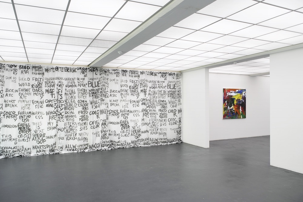
Language is an important element of this artistic discourse. Feinstein’s work is repeatedly defined by speech bubbles, (self)-critical comments and significant key words from individual or collective vocabularies. “Whatever the source of these words and phrases, each is a form of communication, or miscommunication,” comments the artist in a conversation. “Commonplace speech, colloquialisms, clichés that are lacking in emotion. If I’m lucky, they often stage my paintings. I’ve been collecting these enigmas, informally at first, since the 1990s, and in the last six or so years, as what I term flash cards. However, these are one-sided; the question is the phrase, the answer comes through the painting.”
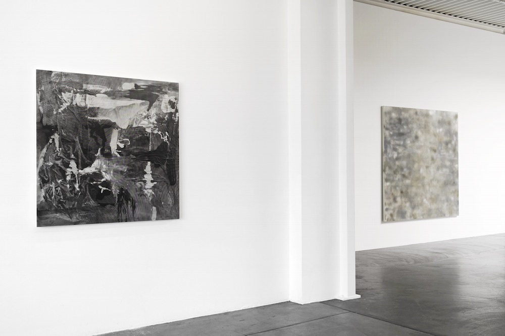
The solo exhibition at the Kunsthaus Baselland, which was developed in collaboration by Ines Goldbach and the artist, follows Feinstein’s major retrospective that, until recently, toured Europe and will conclude this autumn in New York. This new exhibition concentrates particularly on current works: works made by Feinstein over the past two years, in part during a residency in Rome. Maps play a central part here, and not just due to the fact that the artist is always on the move. “Historical maps drew my attention quite recently,” she remarks. “Before and after the 2016 US election, perhaps like many others, I must have looked at maps at least a dozen times a day. While boundaries remained stable, the metrics changed as often. Each work from the last two years began with my selecting and engaging with familiar forms: heart, calendar, monochrome, trophy, etc. Bleep and Plein Air I, II are the only two works that use maps as a ‘form thought’ or foundation… Yes, as you say, maps help us to ‘navigate or orient ourselves’. Since 2016 it’s become increasingly impossible to do that. These paintings are maps of disorientation, obfuscation and deletion.”
Perhaps this is the key to Rochelle Feinstein’s vibrant work, which can raise the pulse if viewers follow where the artist would take them: painting that does not pacify, but is an event, an experience of the world.
Text by Ines Goldbach
…the answer comes through the painting. Rochelle Feinstein in conversation with Ines Goldbach. An interview that began in March 2018.
Ines Goldbach (IG): I would like to start our conversation with paintings you are working at the moment and which started about one, two years ago — works that deal with maps. Maps can help us to navigate or to orientate ourselves: physically, within landscapes, cities and countries, as well as intellectually within certain topics. Do your maps give this kind of orientation within our daily life?
Rochelle Feinstein (RF): Historical maps drew my attention quite recently. Before and after the 2016 US election, perhaps like many others, I must have looked at maps at least a dozen times a day. While boundaries remained stable, the metrics changed as often. Each work of the last two years began by selecting familiar forms: heart, calendar, monochrome, trophy, etc. Bleep and Plein Air I, II are the only two works that use maps as a form thought or foundation. In the past, for numerous reasons, I wouldn’t have chosen mapping as a starting point for a form investigation. Yes, as you say, maps help us to “navigate or orient ourselves”. Since 2016 it’s become increasingly impossible to do that. These paintings are maps of disorientation, obfuscation and deletion.
IG: On the other hand, regarding Bleep for example, there is an exact hint to a location. The image is blurred but there is an indication of a longitude and a latitude. Where does it lead to?
RF: The latitude and longitude locate the White House in Washington, D.C. I used a font culled from United States maps from the 1830s, notably made during the presidency of Andrew Jackson, who is the current president’s favourite leader. Among the many similarities between the two are Jackson’s Indian Affairs Act that led to the diaspora known as The Trail of Tears, and the expansion of the powers of the Executive office.
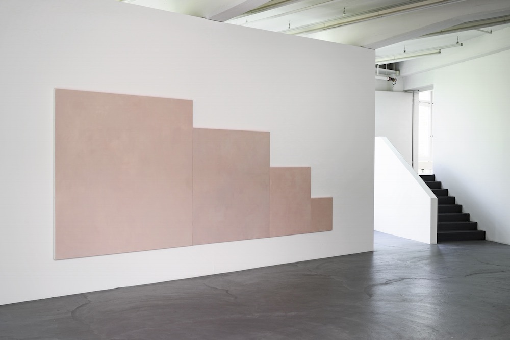
IG: At the Kunsthaus Baselland, the work Wall of Self is also exhibited. The colour you use reminds one very much of the colour of skin. Does this also refer to a map? A mapping of the body?
RF: It is the colour of my skin and of white skin. The work began as a single painting that grew into a proportional ‘family portrait’. The form of the monochrome, obviously, is deliberate. I think it’s less map than portrait. A friend had used the phrase “wall of self” to describe someone she knew. I thought it striking, referring to the pandemic of narcissism disseminated through media, from selfies, ‘likes’, postings, to supremacist and populist factions.
IG: Do the special size and format of the painting — being as it is somehow divided into four square sections of different sizes — go together with this idea of a critical portrait filling a whole exhibition wall?
RF: Definitely. Each of the four slightly off-square rectangles appear to be the same size but in fact aren’t. I recall, without looking at exact sizes, that each painting’s dimensions vary by 2 to 4 inches, horizontally or vertically. I’ve constructed this wall of portraits, of selves; a unit of hegemonic whiteness. Each embodies imperceptible differences within the family group. Might these distinctions be enough to register change? Perhaps not in the present, but change is inevitable.
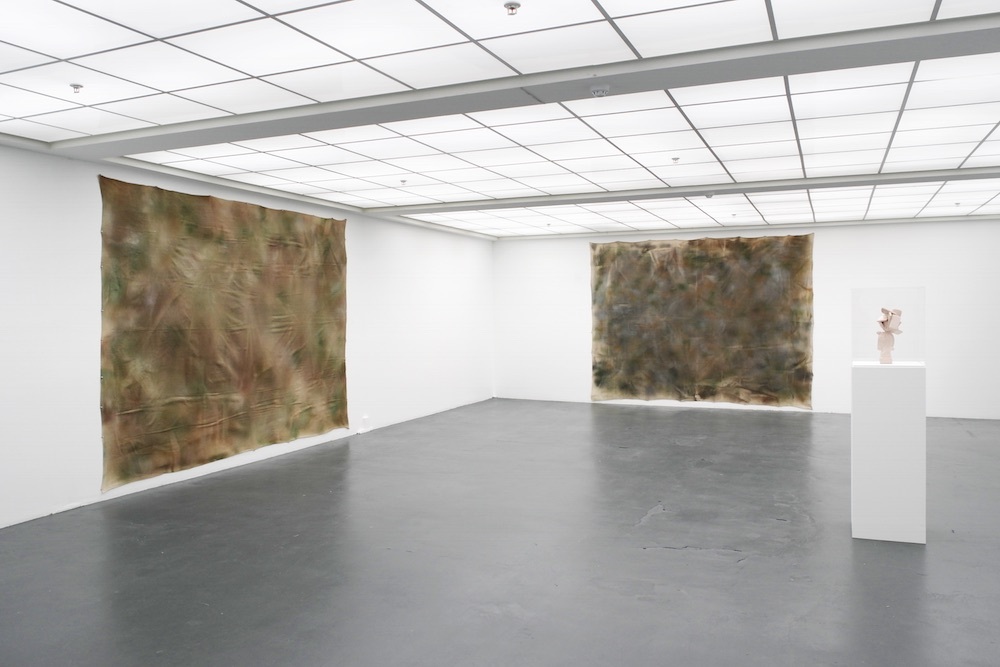
IG: Your new works, titled Plein Air, remind me also of broad landscapes, and maybe it is with good reason that the title Plein Air brings our thoughts as well back to the plein air painters of the 19th century in France who — in connection with the appearance of colours in tubes — went out into the fields to paint. Both of your works were painted in Rome. So on the one hand there is this tradition regarding the paintings and on the other hand there is this very thin, easy to get and somehow cheap material that you painted on and that breaks with this tradition. Is that what interests you here?
RF: What a fantastic symmetry! That hadn’t occurred to me before. The portability of tubed oil paint for the 19th-century painter rhymes with my acquisition, via Amazon two-day Prime delivery, of this drop cloth (brand name: Faithfull). Post-industrial to post-materiality. Perhaps this is a continuation of the tradition, and not a break?
IG: You’re right. The availability of material wherever we may be includes a certain idea of freedom. On the other hand I think it’s quite interesting that you work within a certain tradition of painting, and you’re a painter, but at the same time you release yourself from this tradition, don’t you think? Your topics cover humour, sex, politics and economy, personal themes and collective ones — always making it clear that working and discussing relevant questions does not necessarily mean using traditional methods or materials. How do you see that?
RF: I don’t feel my work is a release from painting at all. In the late 1980s I was just as attached to painting, to my own intentions, however limited they may have been at that time. I was compelled by geometric abstraction. Abandoning those so-called principled conventions was not useful to my ends, which were to stretch, distort and hustle the canon into collaboration with external events ranging from lowbrow to wherever. It became a grappling with the authority of the grid. So, no, I don’t think the traditions of painting preclude subject matters or materials.
IG: But on the other hand I guess that painting nowadays — or art per se —sometimes goes together with art fetishism, with an elitist object that has to be admired. I think that this is something you release your paintings from — not to elevate painting from everyday life but to connect art and life, with all its positive and negative sides, with all the political and social topics, the individual and collective themes.
RF: This art/cultural capital dilemma has existed for decades. Because of the historical weight of abstract painting for my generation, understandably, many went elsewhere. I loathed the idea of mastery, of power in art, so despite the weight, I stayed. Looking back, I believe the chaos of my childhood was a boot camp in unravelling signs, allowing me to approach the dichotomies and trichotomies of art and life. I tried to understand the relational complexities of subject-form-content, as present in images as in speech, through the abstruse medium of painting for two reasons. One, painting is a first love. Two, it was the most deeply ingrained, embattled cultural well to draw from and to transform as a visual language with currency. A somewhat arrogant ambition, I guess, but when I realized that painting could resemble an experience of the everyday while it also resembled abstraction, the deal was sealed.
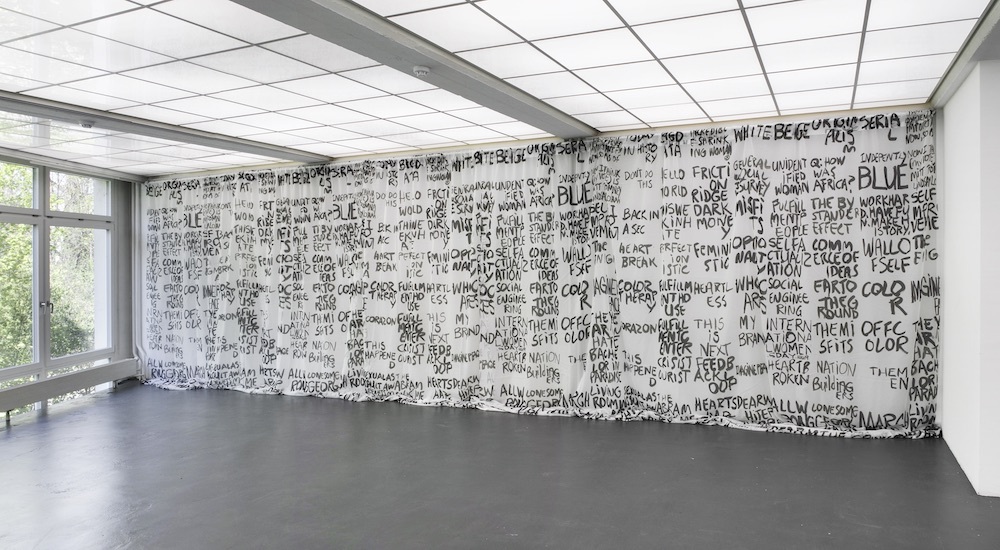
IG: You just mentioned in connection with your new work the product’s name Faithfull. Titles, like the before mentioned Wall of Self or The Week in Hate, as well as words and slogans are very important within your work but also for the viewer who experiences both together. Language has the capacity not only to open up our imagination but to lead us in a certain direction as work titles do. What interests you regarding the parallelism of strong visual images and strong titles, slogans, sentences or words?
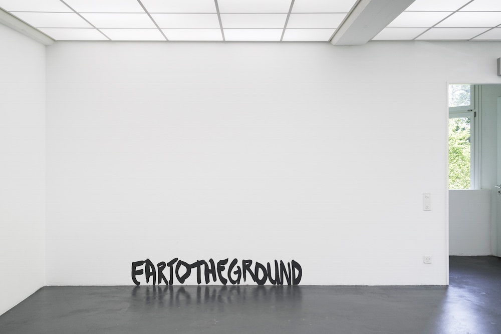
RF: Whatever the source of these words and phrases, each is a form of communication, or miscommunication, commonplace speech, colloquialisms, clichés that are lacking in emotion. If I’m lucky, they often stage my paintings. I’ve been collecting these enigmas, informally at first, since the 1990s, and in the last six or so years, as what I term flash cards. However, these are one-sided; the question is the phrase, the answer comes through the painting. Ear to the Ground is composed from a group of flash cards. Hundreds more are languishing in my studio. I suppose these enigmatic phrases are a way I can be in conversation with a constructed world of communications that change by the day.
IG: I guess also H(e)art Island is a good example of a painting that — at first sight — seems to be soft and positive but it also opens up a lot of questions. By reading the title a connection is made with the symbol of a heart that is within the painting but also with the history of the United States, when one thinks of Hart Island, New York, which contains the whole tragedy of the Civil War. This painting may be a good example of your work bringing beauty, humour and strong political questions into a single work.
RF: I’m very pleased by your double reading of the painting. I’m still not sure, but perhaps the heart shape is recognizable as an emotional signifier? That shape was a first step: a form that resembled an emoji, yet clearly was not an emoji. Originally a symbol of fidelity, it now expresses well over a hundred emotions. So what was this heart? Turning it sideways, attaching it canvas to canvas, created an anomaly, an unfamiliar topography, a volume stuffed and sagging on the bottom edge like ballast, and a new meaning to puzzle out. As you say, Hart Island is a burial site for the Civil War dead, and also an active burial site for the city’s indigent population for the last 135 years through to the present day. It is accessible solely by arrangement with the city, and the families of the dead are the only visitors permitted. I visited the island in December 2016. The painting evolved over the course of a year; however, my visit was providential. I discovered what I term a good problem to work with. There is no ‹love› to be found on Hart Island but perhaps some grace and calm. If that feeling transmits beauty, I’m very pleased.
IG: As one last question I would like to give attention to the paintings Who Cares, which are also part of the exhibition here in Basel. On the one hand, these works open up the question of the original and the unique, and somehow the opposite on the other. Who Cares also sounds like an inner voice asking who cares if the painting is like this or that. Does this mirror as well your way of self-questioning, your way of working, not resting within a certain style, handwriting, etc.?
RF: It’s a pleasure to reply yes, yes, yes to all your observations. Speaking to the ‘original’ painting, it was constructed to embody liquidity, mass, surface and rupture. The basic stuff of painting, intentionally made to produce new originals. The inner voice, as you put it, spoke clearly from the start of this project, while other voices chimed in. 2016, the first year of hate, gave voice to ‘who cares’: about a painting, whatever it looks like, in these increasingly despotic conditions. The familiar phrase is customarily followed by a question mark; in this case it’s omitted, but it is assumed. Some of those who’ve seen these works reply, ‘I do care’. So then we talk. The black-and-white digital painting is rendered in half tone, the mode of offset printing in a pre-digital age. Old news. The ‹original› painting has become two files that have evolved as ongoing chapters of Who Cares. Files are sent to a venue; they are responsible for printing. My two conditions: print on canvas, and at the same size. I leave the result up to whatever printer is used. How to install them, with borders or not, with nails, magnets or grommets; keep them together, or display them in separate spaces; to these questions I reply, sure, yes, okay, do as you wish. Who Cares.
The exhibition were generously supported by Candice Madey, Dr. Georg und Josi Guggenheim Stiftung, Isaac Dreyfus Bernheim Stiftung as well as the partners of Kunsthaus Baselland: kulturelles.bl, Gemeinde Muttenz, Migros Kulturprozent, burckhardtpartner, Anthony Vischer and werner sutter AG.
During Rochelle Feinstein's exhibition the two solo exhibitions by Rossella Biscotti and Naama Tsabar were also on display.